Brief : Medimind is a medication reminder app for older adults and their caregivers. It partners the Medminder, a personal medicine storage device that can remind, track pill inventory and whether pills have been taken.
Role : Individual project
Duration : 3 weeks
Prompt : To make an interface and learn prototyping and design tools, without much research.
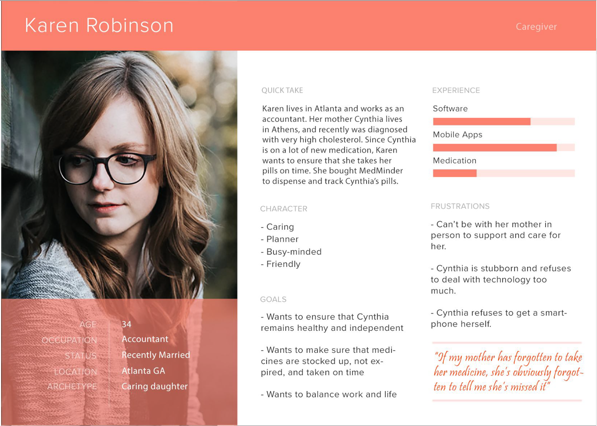
To start, I created a persona and a quick scenario write-up to be able to think of a workflow for the app.
Scenario :
Karen works full-time at a law firm as an accountant. Her mother Martha, 77, lives by herself in Athens. Martha has high cholesterol and blood pressure problems, and needs to take 4 different medicines at various times in the day. John helps Martha with her doctors appointments, refilling medicines at the pharmacy, and ensuring that she knows what pills to take when. It is hard for him to call her and remind her every time during work hours, so he purchased MedMinder, a pill storage, dispensing and reminding device that helps her with medication. Martha speaks to the pharmacist and gets the recommended dosage, timing and pill information. She enters the pills into the device, splitting by dosage and in the right order for Martha to take. She then enters the schedule into the MedMinder app on her phone, so that it can alert Martha to take the medicine in time. The MedMinder rings a small alarm everytime Martha’s medicine is due, and when she approaches the device it opens up the appropriate drawer for her to retrieve her pills. If she takes the pills within the appropriate hour, Martha's app gets updated without a notification. However if for some reason Martha forgets, or is away from the device - a notification gets sent to Karen alerting her which medicine Martha has missed. She then can reach out to her mother directly, or contact her through her friendly neighbors to ensure that Martha is all right and takes the dosage on time. Five days before the dosage in the MedMinder is running out or is close to expiry, Karen gets notified telling her that it’s time to visit the Pharmacist again and consult the doctor for future changes.
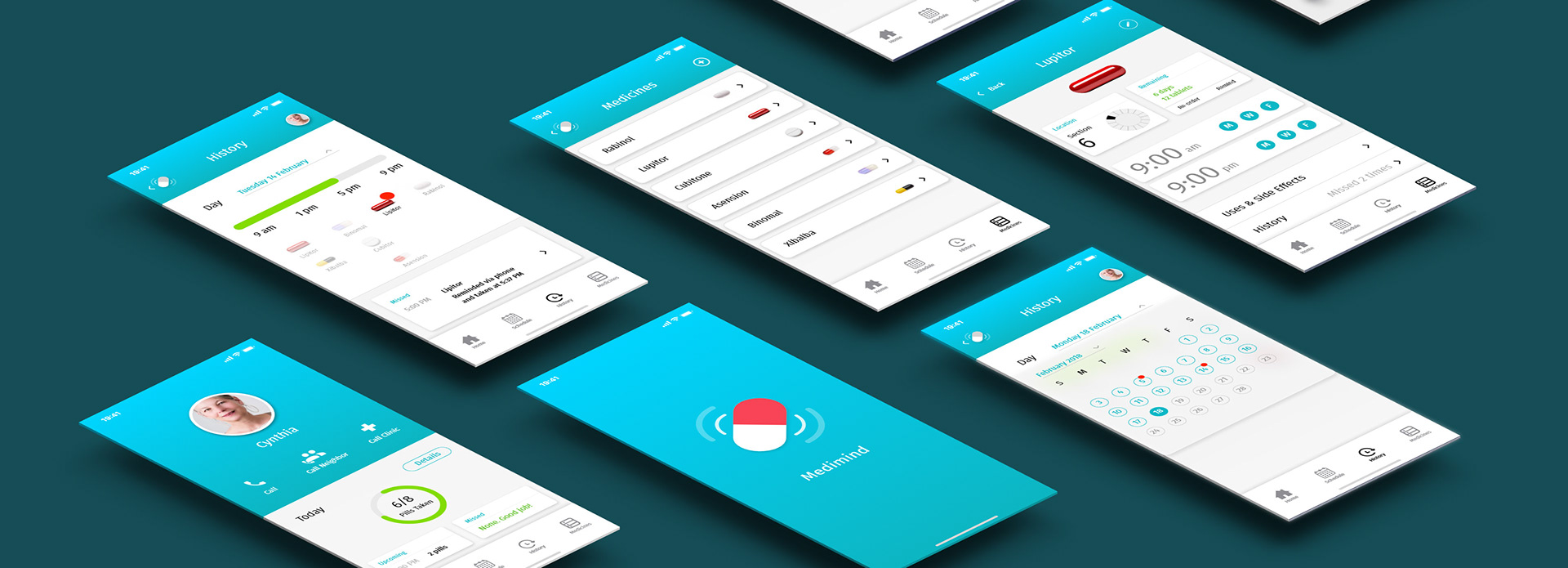
Based on the persona and scenario, I created a quick mockup in Balsamiq for the functionality and screens of the app.
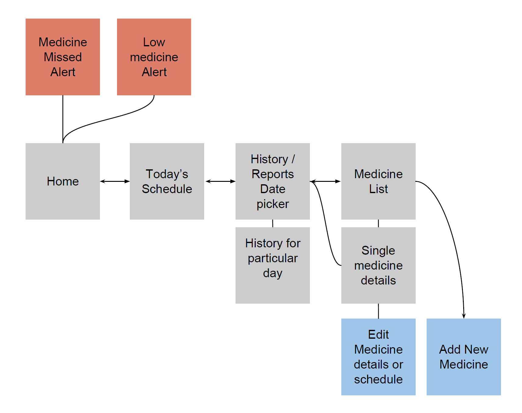

Based on feedback I made some changes and started creating a more detailed app prototype on Adobe XD.
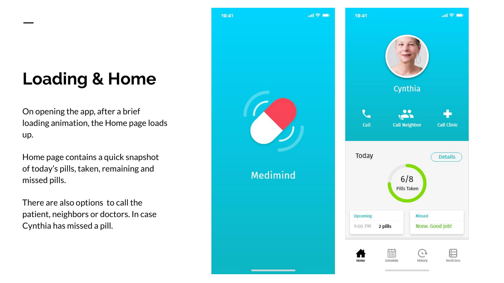
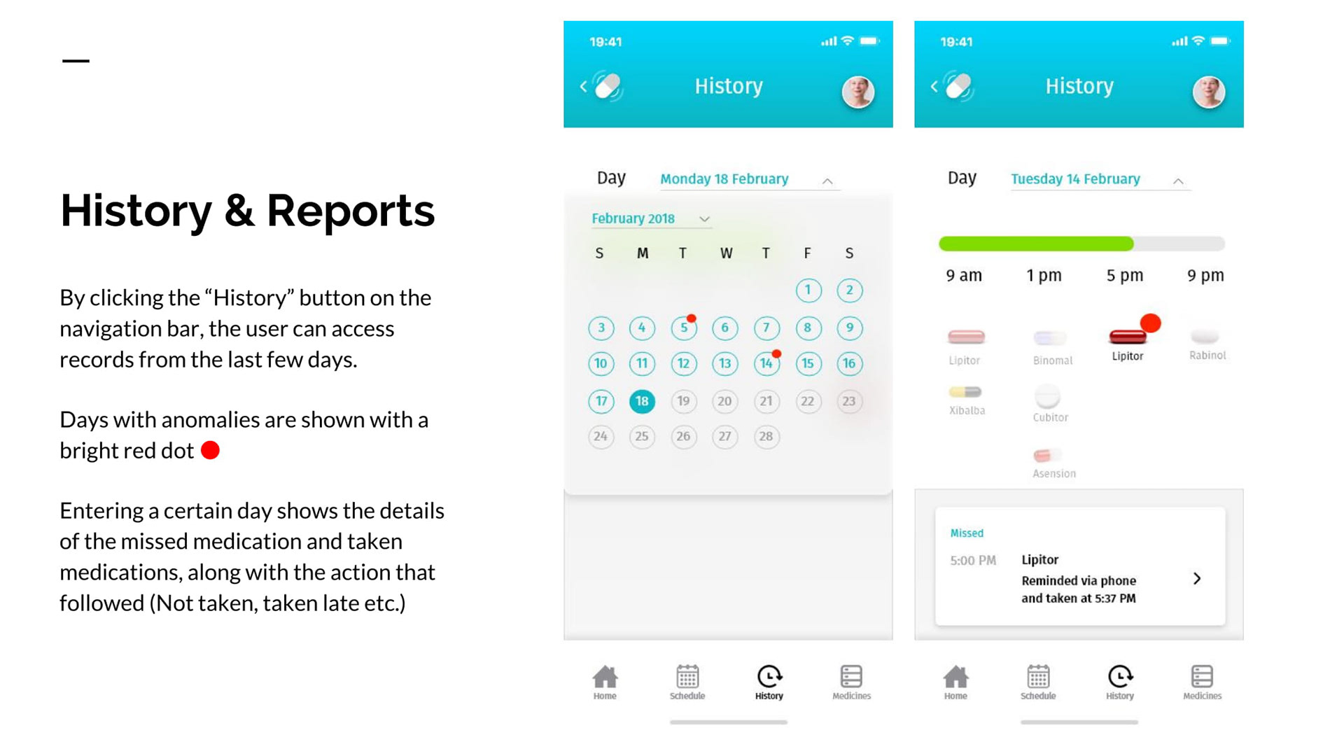
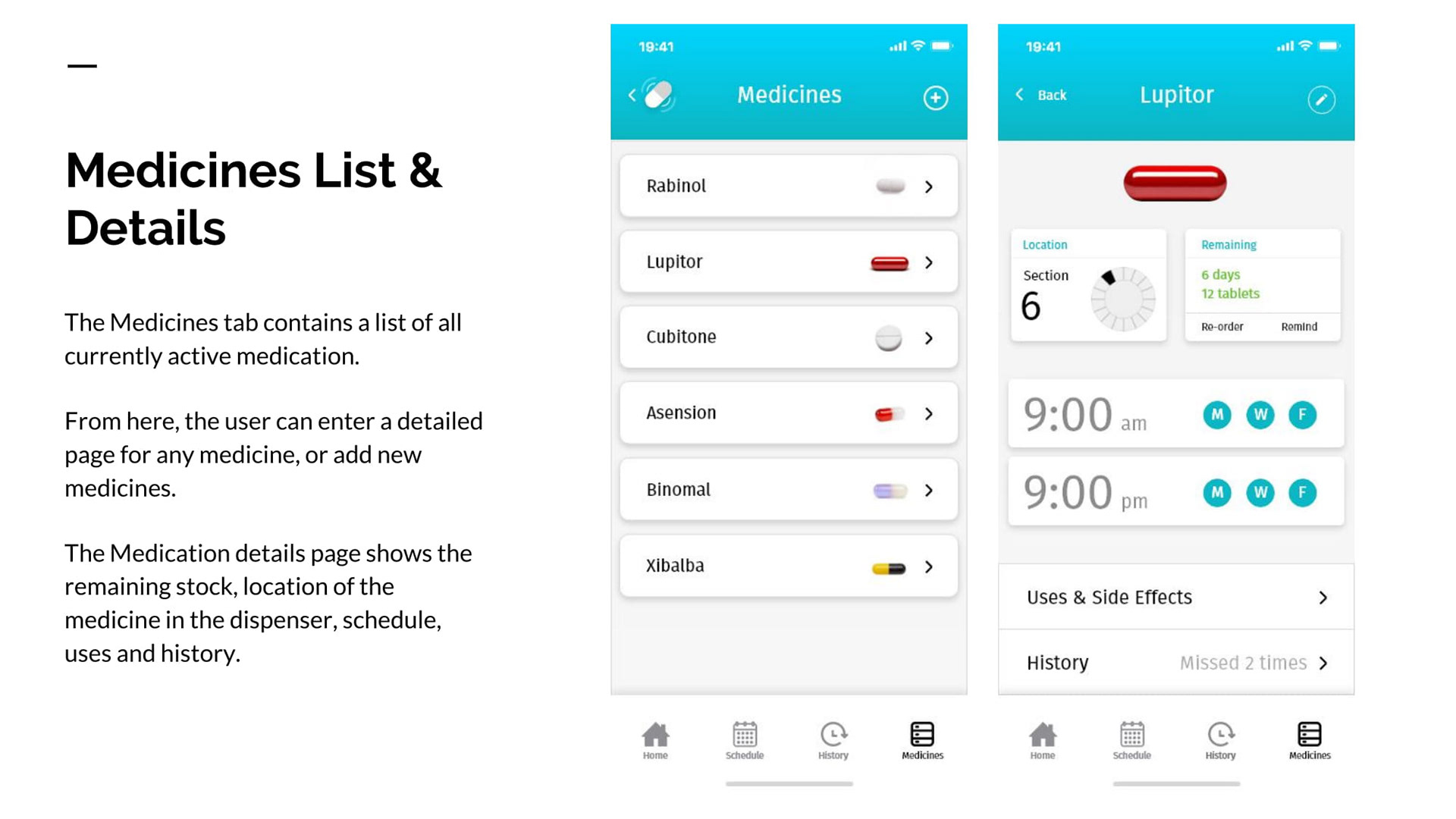
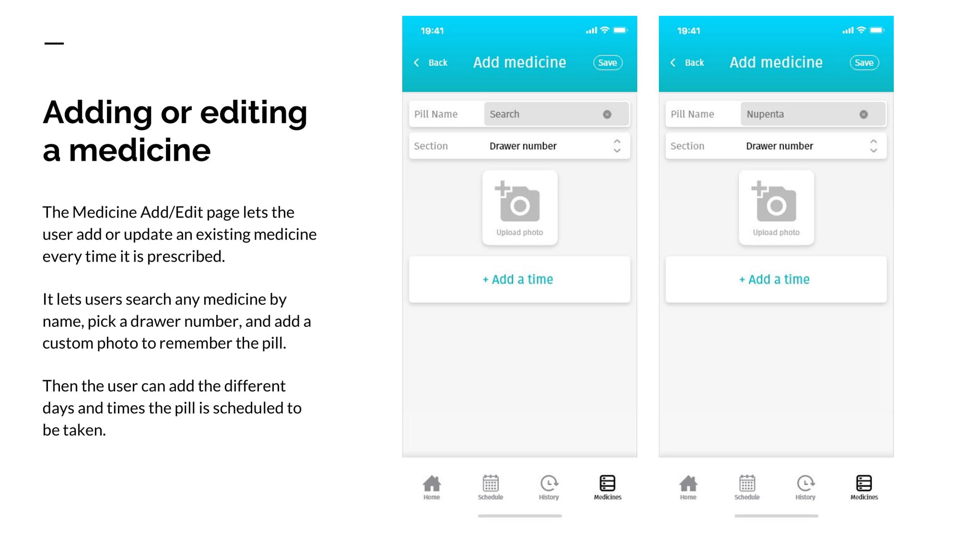
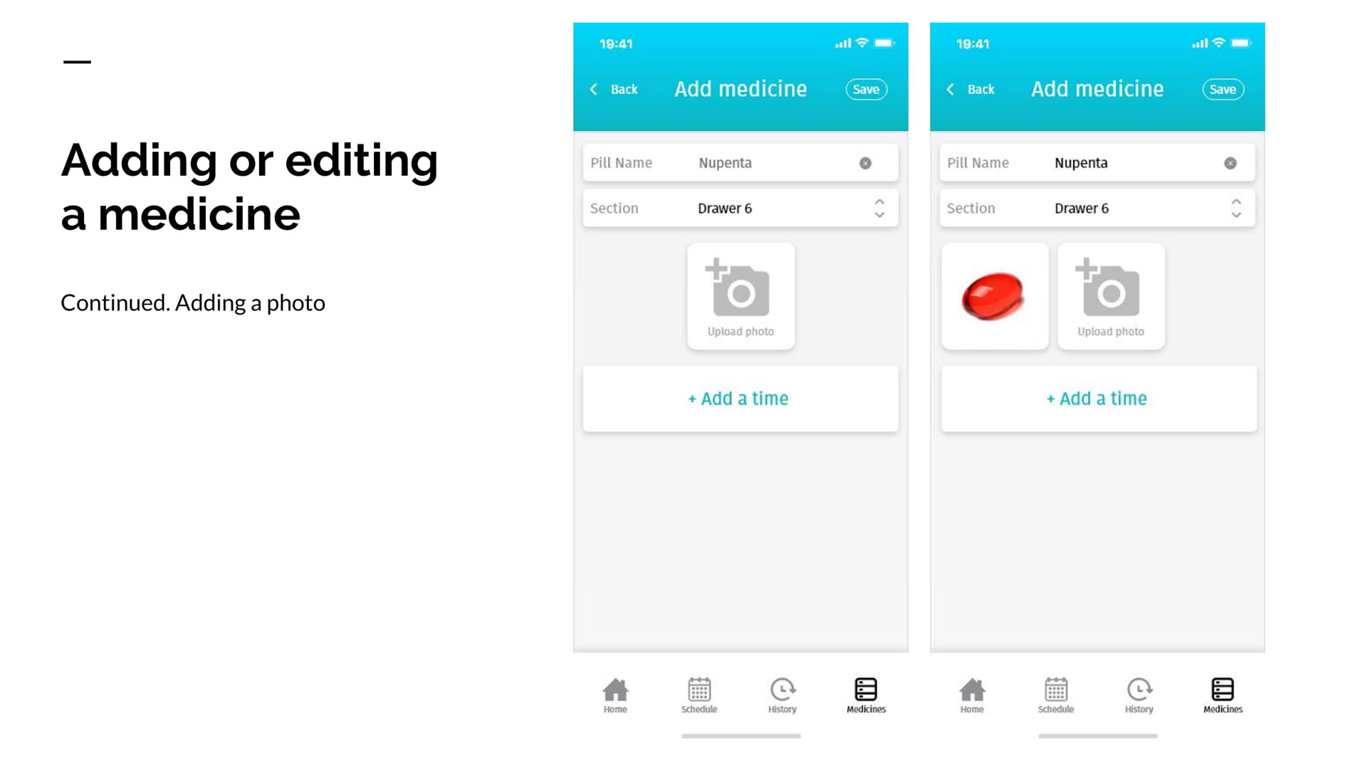
Attached below are a few of the screens I created.

To be able to test the flow and intuitiveness, I created an Invision prototype (embedded here) to be able to test with users. Please interact with the app to test the flow!
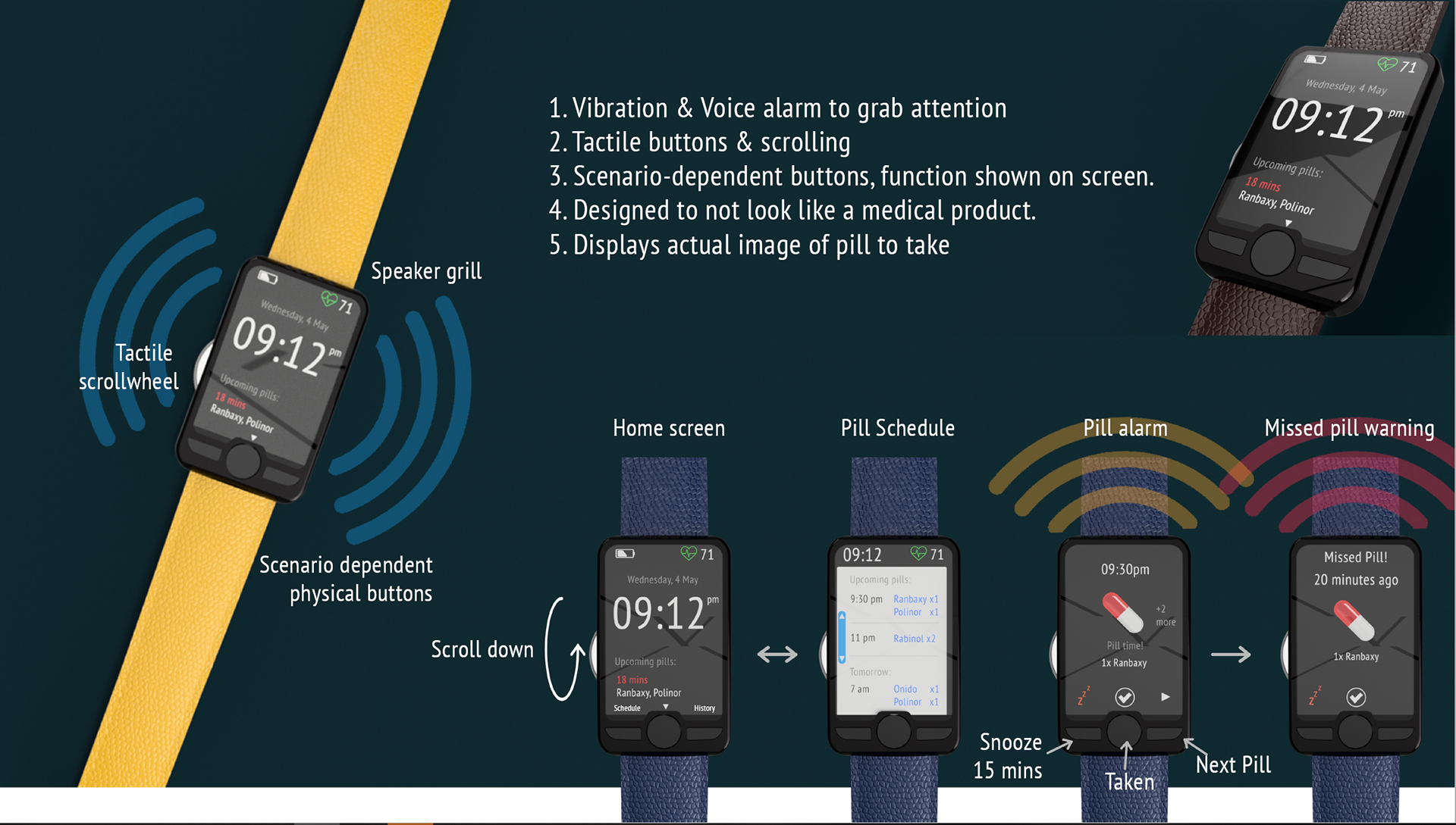
WEARABLE APP FOR THE PATIENT
I then created a smartwatch/band interface for Martha to be able to get reminded of her medication, wherever she was. I built the 3D model in Fusion360 and made the interface in Adobe XD.
QUICK USER FEEDBACK
Parameters to test
- Intuitiveness of the flow, buttons and options
- Completeness of features
- Overall visual feel
- Simplicity of use
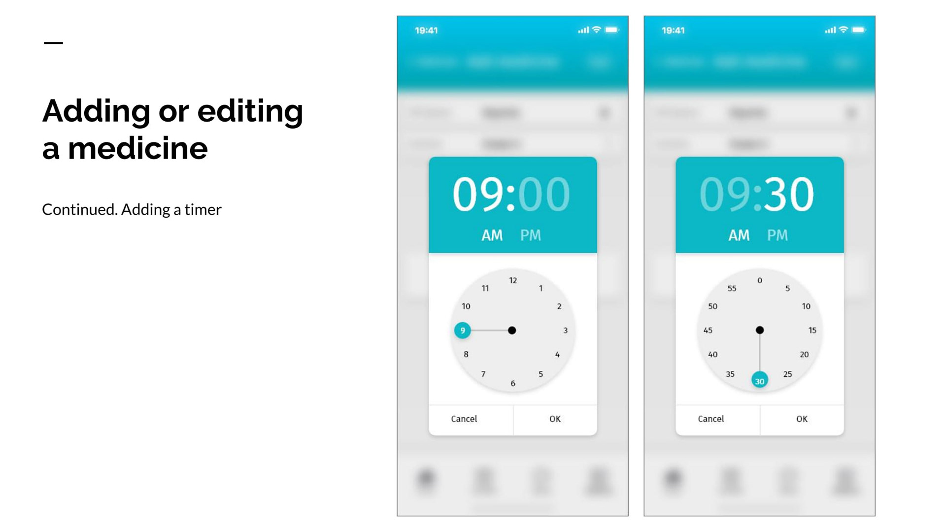
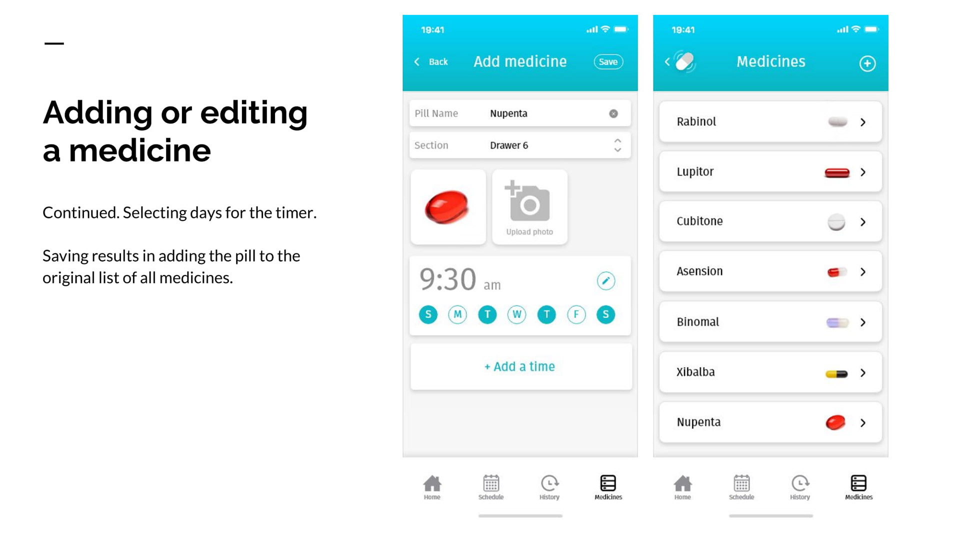
Detailed feature : Adding a medicine
I did some quick user testing with two of my peers to get feedback on the prototype. Here are some of the quick highlights from that study.
USER 1 : JAYANTH
OVERALL FEEDBACK :
Overall, Jayanth really liked the simple flow and familiar arrangement of options on the screen. He appreciated not having to look for buttons or options, and that it was really easy to navigate around. He also commented on the use of whitespace making it visually pleasant and easy to read everything on screen.
ON SIMPLICITY :
Liked the linear flow, and that there aren’t a lot of options. Seemed coherent with other apps.
ON INTUITIVENESS :
Seemed intuitive. Didn’t have to hunt for or look for a button or option anywhere.
However the red dot on the missed pill didn’t seem obvious, seemed more like a general notification. Donut chart on the home-page also wasn’t clear, would have preferred a simple progress bar.
ON COMPLETENESS OF FEATURES :
Liked the linear flow, and that there aren’t a lot of options. Seemed coherent with other apps.
Overall there are enough features to be usable and not excess features to make it confusing. Could add a feature for switching between multiple patients.
USER 2: NEERAJ
OVERALL FEEDBACK :
Overall, Neeraj liked the app both by functionality and design. He felt it was very easy to use, clear to navigate and designed well. He appreciated that most of the things he would use the app for showed up on the front page.
ON SIMPLICITY :
Liked the simple flow, and that it felt similar to regular apps. Text sizing is a bit small. Simple to use : the first screen has the necessary tasks of remind and confirm.
ON INTUITIVENESS :
Structure was clear. Information was displayed clearly. He felt that the History tab on the Nav bar could be at the end, because he would interact with the first 3 options more.
On the medicine page, he didn’t understand the location of the medicine in the device, but also because he hadn’t seen the dispenser yet.
Time needed to learn should be small because of the intuitive layout.
ON COMPLETENESS OF FEATURES :
Option to change number of pills and dosage was missing in the add/edit medicine page.
ON VISUAL FEEL :
Good layout with relatable Icons.
On the schedule page : check-marks on the medicines felt like toggle button more than pills that were already taken, so he tried to press them and see what happens.
CONCLUSION
With the user feedback, I understood that people appreciated the simple flow, familiar approach to design the app. A few graphical representations such as red dot, Medimind's dispenser icon and so on could be visualized better. Text size on the smaller buttons could be improved as well.
For a future iteration, I would design for multiple patients, enter date ranges for medication, allow the users to change number of pills.
The project was done entirely using Balsamiq, Adobe XD, and Invision. Icons were used and modified from the Noun Project.