Role : Sole UX researcher, designer and app developer on the team
Users : Clinicians and Orthotists who diagnose and prescribe orthoses.
Tools used : Adobe XD, Adobe Illustrator, Draw.io
Developed using the Facebook-backed framework React Native
Brief :
To design and develop a tablet app to help clinicians visualize patient walking data. The data is received through an instrumented leg-wearable, providing indicative statistics on important gait characteristics, such as ankle angle and torque.
Introduction :
The team is researching and developing an instrumented Orthosis, a device that supports, limits, or assists foot and ankle motion.
The device enables different configurations of ankle stiffness, senses walking data and analyzes and recommends optimized and personalized AFOs for different patients.
I designed and developed a tablet-based app for clinicians to perform walking tests for these patients wearing the Orthosis. The aim is to be able to provide clinicians with insightful visuals and actionable data to adjust configurations of the device, as well as understand their impact on the patient.
Main features :
To guide clinicians to perform several clinical tests to make adjustments to the ankle foot orthosis under different conditions of walking (level ground, incline and stairs).
The app then receives and presents the data to the clinician in a usable, intuitive manner
To get insights and recommendations for further testing.
Existing process :
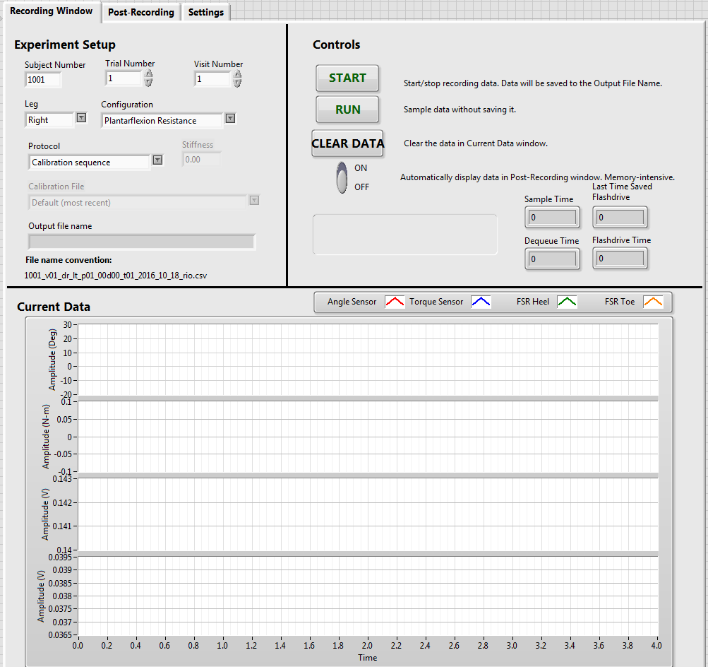
There is no existing process to use perform tests on the device. The team internally observes the data on a computer through data-acquisition software. The software displays multiple indicators for all data collected.
Why this is needed :
This is a new tool for diagnosis and the method is unfamiliar to clinicians. We need to guide clinicians to perform tests, analyze results and make adjustments.
The device currently senses a lot of data, including ankle angle, dorsiflexion and plantarflexion angles, torque at different points, interface pressure. To make diagnosis faster, it is important to identify and display actionable data and insightful information to the clinician.
A wireless interface will allow the clinician to monitor the patients, observe their walking as well as the data without being restricted to a desk.
I designed a tablet app to visualize data and help with performing tests.
Understanding the project
I worked with experts from the Clinical Biomechanics lab who have had experience in the past with clinical testing and diagnosis. I spent 3 weeks understanding how clinical trials are done, recommendations are made and how tests are performed. It helped to get familiar with clinical processes, methods and even terms and technical language.
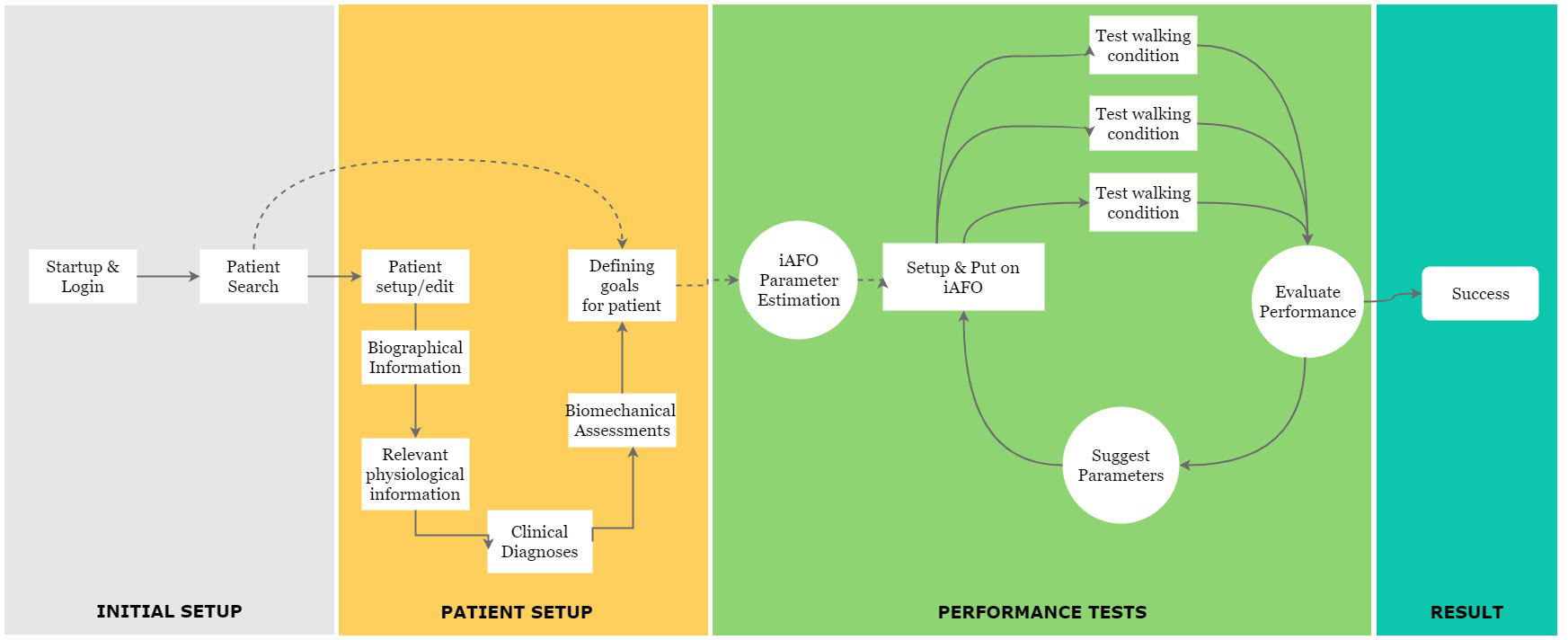
Based on my learning, I created an initial set of wireflows for the testing process, to be able to define where the app could fit into the process. Here is the initial workflow map that I created.
Clinician's Journey
Initial Insights
1. Ankle angle, Torque on the ankle, and Interface pressure were the most crucial parameters.
2. Both graphical visualization of the walking characteristics and key values are important to note.
3. There are 5 types of tests : Level ground, incline walk, decline walk, ascending stairs and descending stairs.
4. It is helpful to compare walking curves of one test against another test.
A mobile-first approach
Through the project, I was able to guide the team through a minimalist design-thinking approach, and ensured that the team was focused on getting only the most actionable and relevant data on screen. This was important, as there is a lot of possible data and analysis possible, and it was tempting to introduce all these elements onto the dashboard.
This is crucial, because overwhelming the clinicians with too much information would only lead to confusion, longer turnaround times for prescriptions and testing.
Below is the first version of the wire-frame (build in XD)

The initial screens are focused on setting up new patients, entering physiological and diagnostic information, and getting an initial list of settings for the AFO.
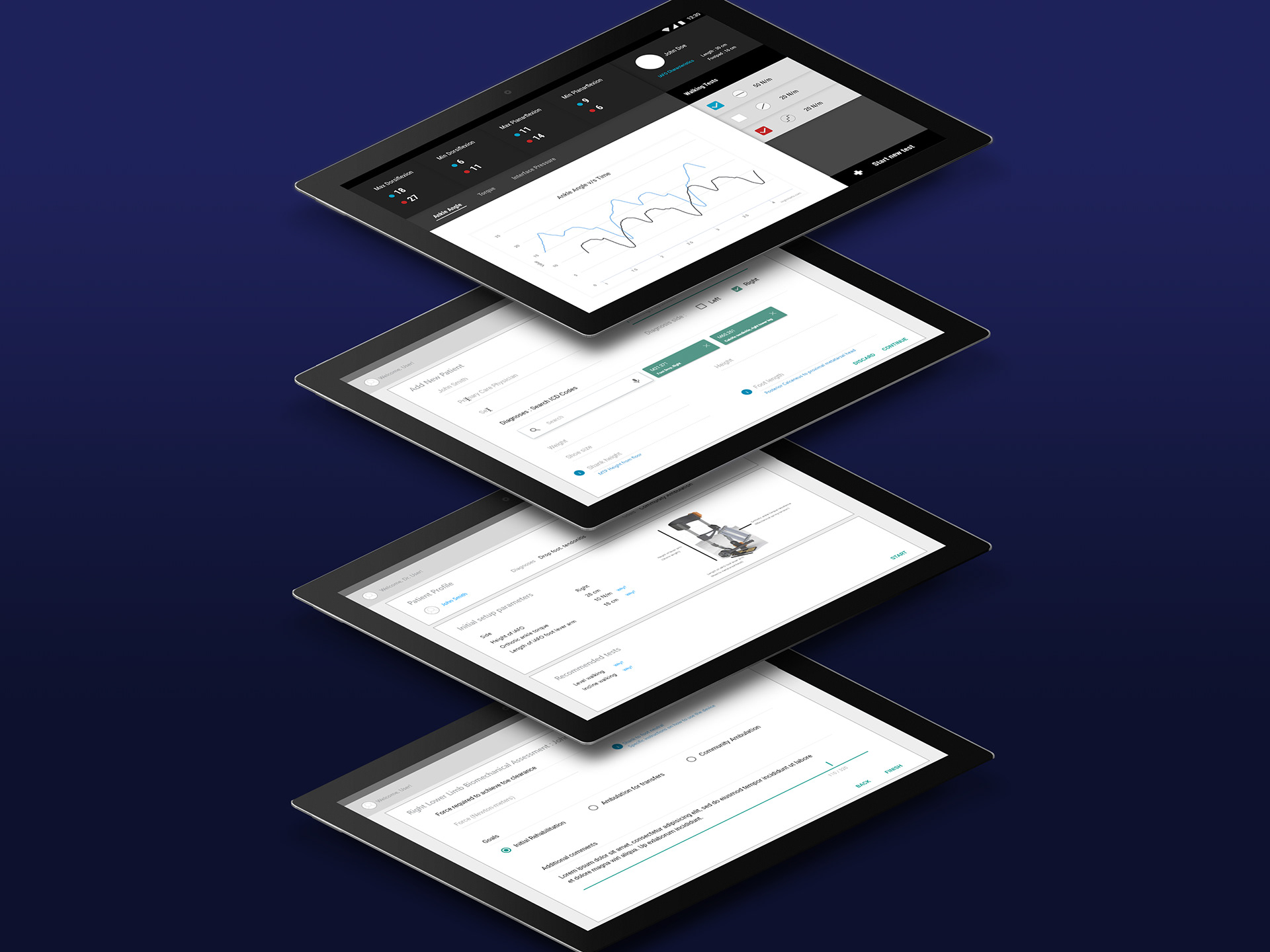
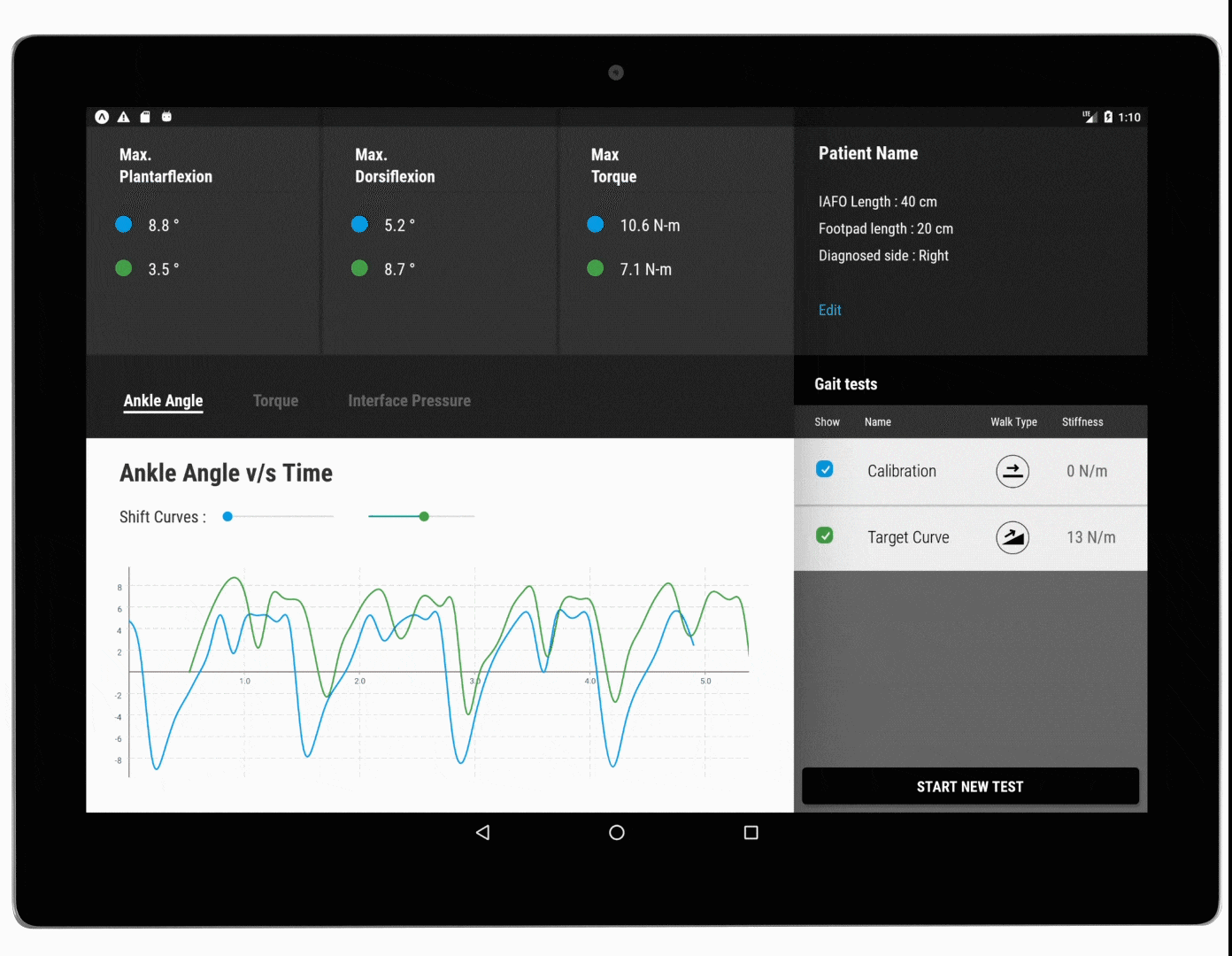
The most crucial screen for the proof-of-concept is the dashboard, where clinicians perform tests, observe data, and compare data against other tests or target curves.

Shortcomings on version 1
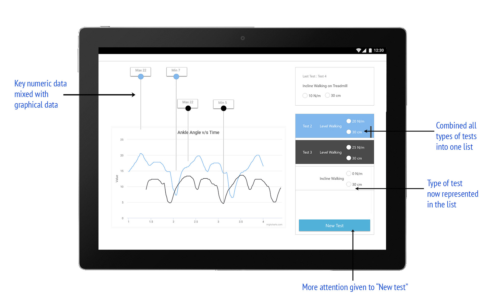
After getting feedback from this initial wireframe, I did an analysis of the dashboard for further refinement of the elements on the screen. Key problems in the interface at this stage were :
1. The numeric/peak data and curves could not be visualized together
2. Tab-navigation between the different types of test did not feel intuitive
3. The actual test results looked like it took lesser priority and importance on the page.
4. The page felt cluttered, and it felt counter-intuitive for new users.
Key insights & decisions in redesign
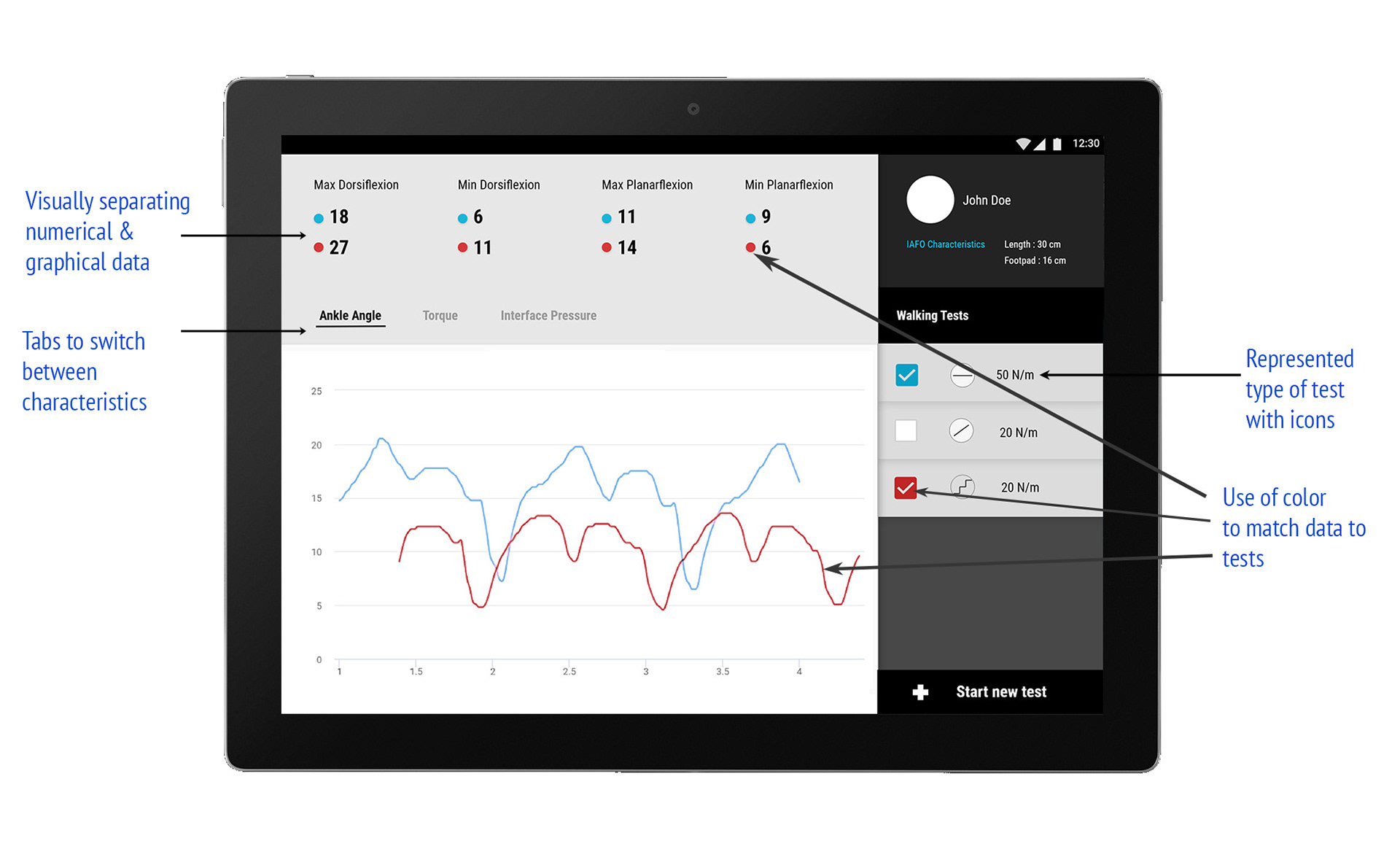
I started to redesign the app, by further consulting the experts. One key learning from this round was that there would usually not be more than 4-6 tests in a single session to compare. Based on this insight, I decided to group all tests together in a list, and get rid of the tab-like navigation for performing and observing tests. To represent the type of test I designed icons to indicate level, incline or stair walks.
Reducing the patient information from the bar above to only highlights in a corner, the dashboard gets a lot of real-estate to present the most important information, testing data.
This way, we are able to present both numerical and graphical data together.
After observing some sample recordings of data, we can observe very similar and repetitive patterns, so it felt unnecessary to represent the peaks with the numeric data. This also gave the opportunity to represent numeric data in a more organized format, and separate it from the graphical data.
And to connect all elements of tests, numeric and graphical data, color works really well as a way to create intuitive linkage. I created a palette of 10 colors, one of which would be assigned to each test conducted. The color is used as the toggle checkbox in the list of tests, curve in the visualization, and as a dot near each key metric.
Visual redesign to re-enforce hierarchy of information, and clear separation of content and control.
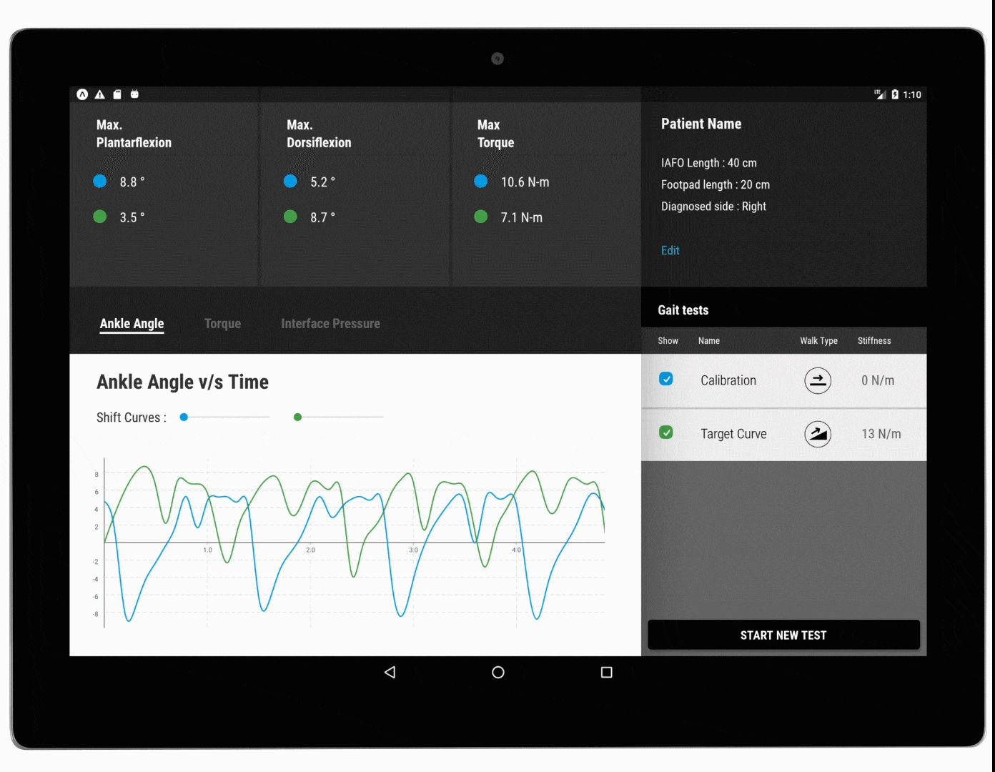
During development, we ran into an unanticipated challenge. Since data for each test starts streaming in at different points, different tests get layered on top out-of-phase. For clinical comparison, it is useful to observe peaks and troughs in data layered in phase. We discussed the possible development-based solution, ranging from getting more sensor data to mark starting points, or machine learning algorithms to identify patterns in curves. But we were able to come up with a simple, design based solution : a simple slider that helps match curves, and it saved many hours and complexity of development work.
There is simple tab-like navigation to switch between different characteristic.
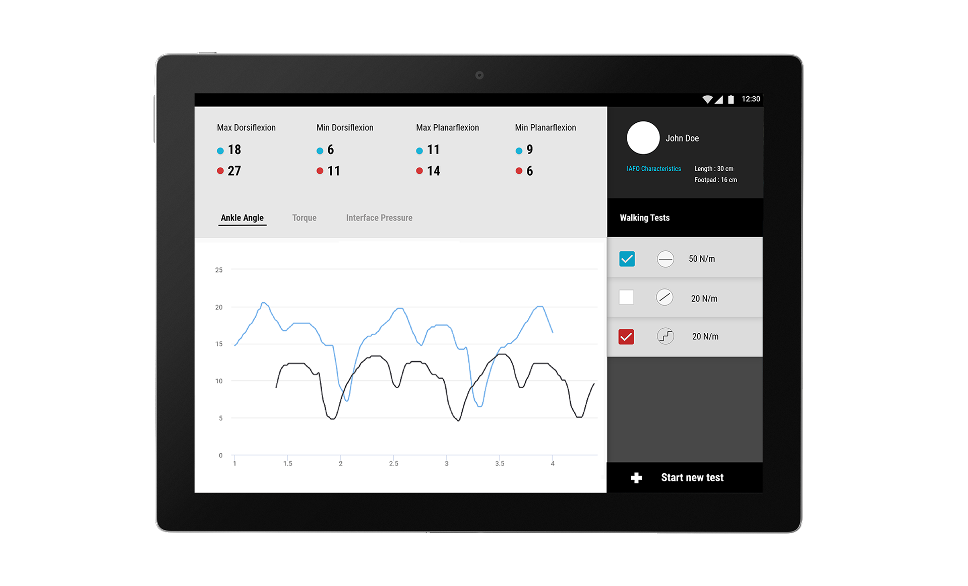
Version 3 & Development
I then developed this app for a proof-of-concept, using the Facebook-backed cross-platform development system React Native. I learned React Native for this project, as it would help for deciding between iOS/Android platforms, have faster development cycles and still be native to both operating systems.
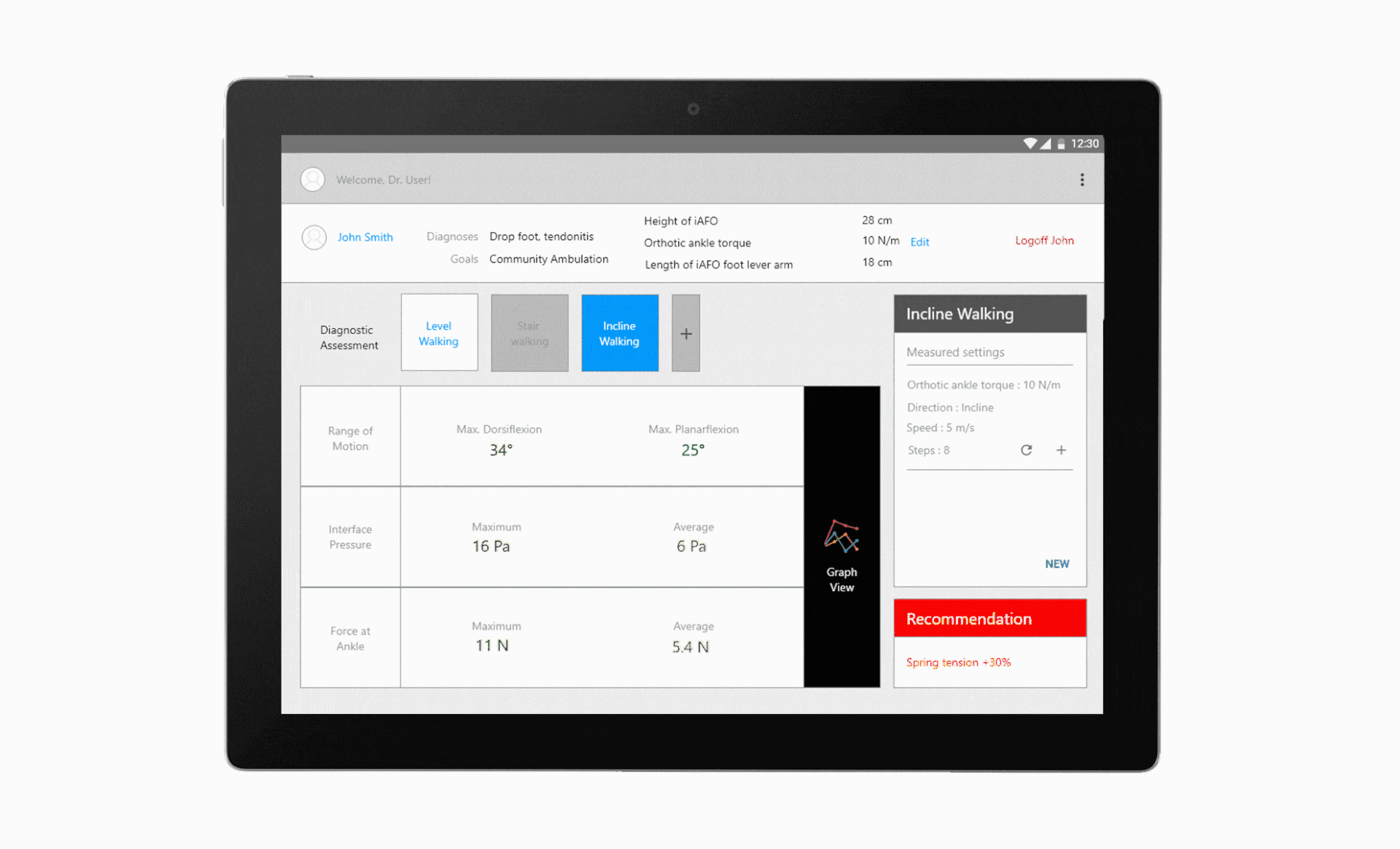
Here is the developed app (recorded on an emulator) and a few features demonstrated.
Users can choose and compare between tests by selecting all relevant tests, or perform new tests and categorize and compare them.

This project is still in progress, and this semester I’m working towards user testing, concept testing with more clinicians and creating marketing videos and collateral.